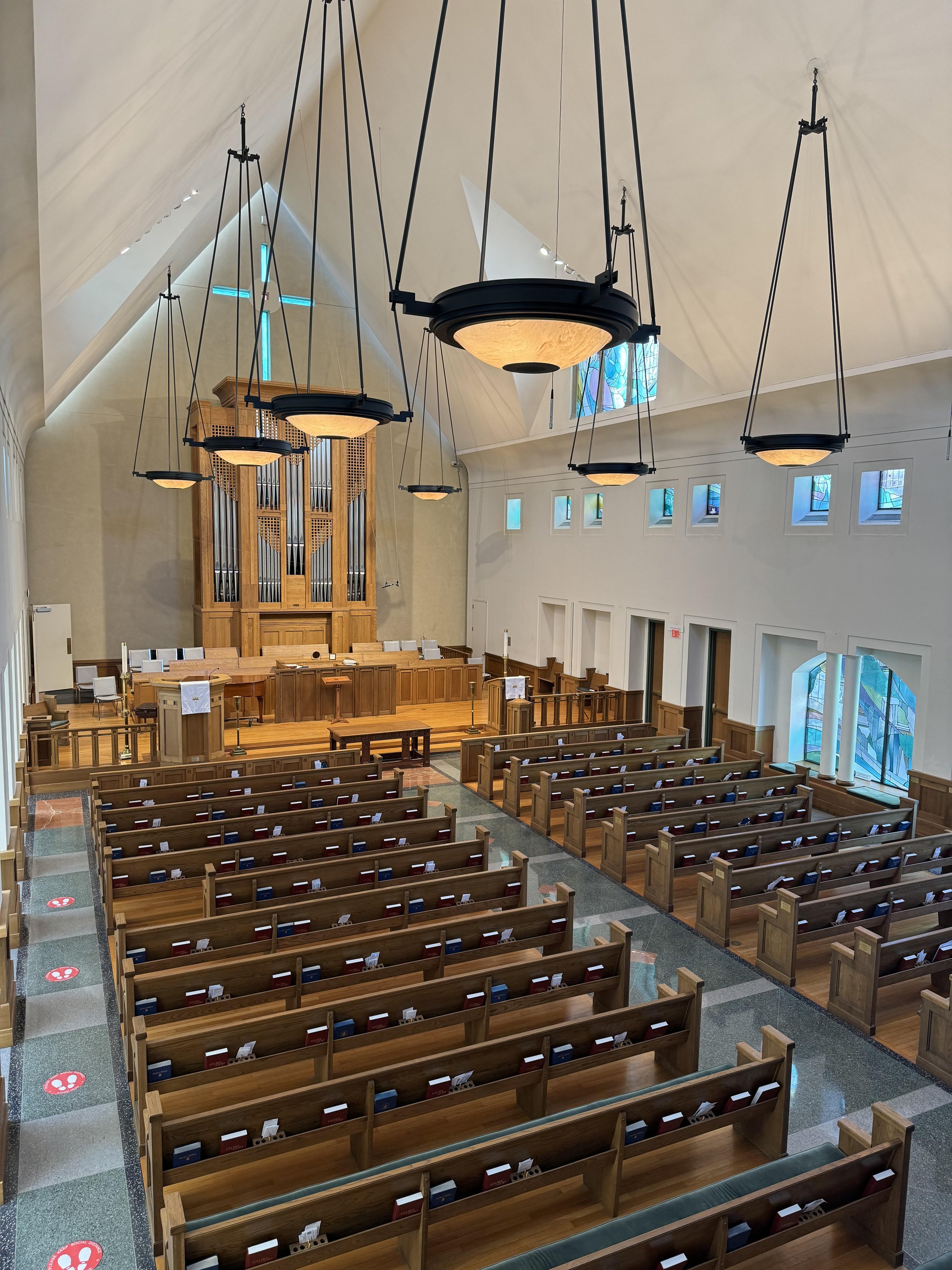
OUR SANCTUARY
ARCHITECTURE
On June 13, 2021, Peter Gluck, architect of Hitchcock’s Sanctuary came to speak to our congregation about his design. Thanks to Steve Taylor and Andrew Hall for video taping and editing the video below. Thanks to Betsy Bush for arranging this event and all those who came to learn more about how the Sanctuary was designed.
THE 1990 SANCTUARY DESIGNED BY ARCHITECT PETER L. GLUCK
In 1986, Hitchcock’s original 1917 Sanctuary was destroyed by fire. The architect of the new structure was chosen through a competition. The winner, Peter L. Gluck, happened to be a Scarsdale native and graduate of Scarsdale High School, class of 1957. Building began in 1988 and the new Sanctuary was dedicated in October 1990. (Note that Hitchcock’s other buildings were not harmed in the fire: The Children’s House (1928) and the 1954 Memorial Building.)
Perhaps the biggest difference in the two buildings is the height of the interior. In order not to disrupt the rooflines of the houses along Walworth Avenue, the new building gained height by bringing the main floor down to the Greenacres Avenue entrance level. Previously, the Sanctuary was at street level on Walworth, and the lower level was Sunday School classrooms. By bringing the main entrance to the Greenacres side with the secondary entrance on Walworth, the balcony was created, as well as a spacious interior that was filled with natural light. The new building now included the choir room and flower room while also connecting to the Memorial Building and the Children’s House.
Mr. Gluck’s 1990 Sanctuary is a post-modern design that incorporates parts of the original structure, the bell tower and the stone foundation wall on the Greenacres Avenue side. But it also includes some features that make it a modernist as well as a post-modern building. Some of these features include:
THE LITERAL FRAGMENT
This is the term Mr. Gluck gives to the triangular stone façade on the Walworth Avenue side. The fragment references both the traditional church building that had once stood there and the tradition of Norman Gothic church buildings generally. The stones used in this fragment were taken from the ruins of the fire. Each stone was individually shaped through a computer-generated process, an early use of this technology.
The depth of this stone wall, most visible in the row of three Gothic windows, is another reference to the monumental nature of traditional stone churches; by contrast, the thin stucco walls of the new building embody the modernist ideal.
Another interesting feature: On either side of the literal fragment are small, square prismatic windows, most visible from the inside. These are symbolic of the Transept that is found in cathedrals and other traditional church buildings, in which the central aisle is transected by the Transept, so that the floor plan creates the shape of a cross.
THE “REVEAL” BETWEEN ROOF AND WALL
A beautiful and unusual feature of the building, most visible from inside, is the “reveal” between the planes of the building, giving the impression that the roof and the walls never touch. This stunning effect, made possible by strips of narrow glass skylights on the north and south walls of the building, make it appear as though the ceiling were floating above the building.
A well-known example of this effect in use is Le Corbusier’s Chapel at Ronchamp, France (1955). The chapel also had thick walls with deep, angled windows, which are also referenced in our Sanctuary.
INVERTED MOLDING
In another unexpected twist, the doorways and windows on the interior do not have traditional wood molding; rather they have indented or inverted moldings. They are a nod to the fine craftsmanship of the interior’s finishing.
THE PLAY OF LIGHT ON THE INTERIOR WALLS
White walls are in keeping with the Reformed Protestant tradition, where one is expected to listen, read and think on The Word, rather than look at pictorial stained glass windows or paintings. But in Peter Gluck’s interior, we are also made aware of sunlight and of nature outside coming into the space, and we are conscious of changes in weather and the direction of the sun. In many ways the building allows these elements of sun, clouds, rain and snow, and of the passage of time to become an integral part of worship.
At his presentation to Hitchcock on June 13, 2021, Mr. Gluck mentioned that he meant the building to be playful, to be a place where there could be multiple interpretations of the building’s design elements. Thirty years after its dedication, the beautiful Sanctuary designed by Peter Gluck has proved to be as unique and resilient as its congregation. It is exactly the building we need.
Written by Betsy Bush
Peter Gluck and Betsy Bush (June 13, 2021)
Photos by A. Galhardo (June 13, 2021)


